
In previous articles in this series, we discussed how certain biases and laws influence the usability and conversion of a digital product and how our users may react to these stimuli. This time, we’ll discuss principles that help balance three key aspects: perception, memory, and efficiency.
1. Jakob’s Law: User Expectations
This law, coined by Jakob Nielsen, co-founder of the Norman Nielsen Group, states that users browse many websites before reaching ours, so they expect our product to work similarly to what they already know.
Applications in Design:
- Research and adopt familiar design patterns. By using common navigation elements and flows, you reduce the learning curve and allow users to adapt quickly. Familiarity breeds trust.
Avoid:
- Reinvent the wheel. While innovation is a great differentiator, if something breaks with those familiar patterns, it will increase friction, which can cause our users to leave.
Examples: Airbnb and Booking
Both sites have similar flows, elements, and icons, allowing for natural navigation between products.

Image Courtesy of AirBnb.

Image courtesy of Booking.
2. Tesler’s Law: Conservation of Complexity
This law states that complexity in a system doesn’t disappear; it redistributes. Larry Tesler, a computer scientist and user interface designer, proposes minimizing cognitive barriers and unnecessary steps that may make it difficult for users to complete a task.
Applications in Design:
- Break down long processes into guided steps to reduce cognitive load, whether it’s forms, activities, checkout processes, etc.
- A simple «Remember details» checkbox can simplify both the login and checkout process for the user.
Avoid:
- Simplifying the interface too much that it becomes difficult to use.
Example: Bold Interface
Bold uses a checkbox on its purchase form to facilitate future purchases by saving both user information and payment method data.
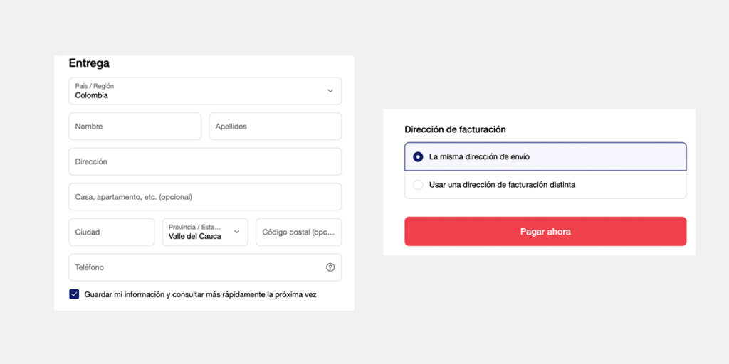
Image courtesy of Bold.
3. Doherty’s Law: Immediate feedback
The origin of this law arises with the article “Comparison of programming systems and the Doherty Threshold” by Walter J. Doherty in 1976 and tells us that when a system responds in less than 400 ms, users stay in the flow and feel in control.
Applications in Design:
- Provide immediate feedback on user actions. This will make them feel recognized and increase engagement. This can help us reduce errors by guiding them in the right direction.
- Use animations such as progress bars or loading screens during long wait times to prevent users from abandoning processes.
Avoid:
The constant or excessive use of images, animations, visual effects, or elements, as users may find them distracting.
Example: TwinBru
Twinbru makes great use of loading animations that calm the user.

Image courtesy of TwinBru.
Conclusions and Next Steps:
These principles provide key characteristics for our designs: A digital product must be intuitive, fast, and consistent with user expectations. Reducing friction isn’t just about visual design, but also about respecting how we perceive, memorize, and process information.
The next time you review your digital product, ask yourself:
- Am I meeting user expectations?
- Am I reducing complexity or just transforming it?
- Is my interface fast and visually clear?
At Blaster, we drive the evolution of your digital products. Contact us and schedule a personalized UX/UI consultation to discover how to create more intuitive interfaces and digital solutions that make a difference.
Learn more about how technology and innovation impact design.